Stay in the Loop
BSR publishes on a weekly schedule, with an email newsletter every Wednesday and Thursday morning. There’s no paywall, and subscribing is always free.
Senior show at West Chester U.
 F. Lennox Campello
The trouble with art students:
Could it be their teachers?
F. LENNOX CAMPELLO
Because I’m in the process of curating a traveling exhibition of undergraduate art student work, in the last few months I’ve seen plenty of student art from Mid-Atlantic schools and universities. West Chester University’s Senior Art Exhibition fits neatly into the pattern of most student art shows: some spectacularly bad work, a wide median of adequate work and a few flashes of brilliance.
This exhibition is spread among three galleries at the university’s Mitchell Hall. Two of them are full of the work of visual artists, while a third has presentations from the graphic design students.
One word about the latter: I was uniformly impressed as to how professional and exceptionally good nearly all the graphic design commercial displays looked, and it is clear that WCU has a very good graphic design program going on.
The other two galleries are packed with drawings, paintings, prints and sculptures, and they received the focus of my attention.
A failure of most art schools
Like most student artwork, and with a handful of exceptions, presentation is an issue with much of the art in this exhibition. It’s a reflection of a continuing problem: the failure of most art schools to teach young artists about the professional presentation of artwork— especially artwork that's for sale, as is nearly every piece in this show.
Also like most student shows, this one contains quite a few lazy entries— work that’s clearly a last-minute ditch to get something exhibited. I was especially disappointed by the exhibition’s large number of inferior charcoal figure study sketches.
Prices or the “pricing policy” is also an issue here. An astounding number of works are priced as “POR,” or “price on request.” This practice— a rare practice, to be sure— is always baffling to me when I see it. Whoever advised the students to use this pricing mechanism needs to realize that art is not seasonal fish and that art exhibitions are not menus. Artwork is either for sale or not for sale, not “priced on request.”
Creative talent, technical flaws
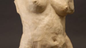
Erica Volpe, the Third Prize winner in this exhibition, like many of the students in this show displays work in a diverse variety of genres and media; she’s better at some than others. Her best piece in this show is a classical female plaster sculpture titled Lust, Like, Love, although— talking about presentation again— it really concerned me that Volpe hadn’t bothered to sand down the plaster edge separation lines on the piece.
Two of her three photographs on the exhibition also merit a good grade for the subject matter, especially Think about the gray, a textual piece about the middle ground of the abortion debate where the artist holds a sign whose text attempts to bridge the gap between two viewpoints. Volpe clearly possesses some talent in this genre but definitely needs to develop her photographic skills a bit more, as the photos themselves lack a range of whites and are uniformly too grayish for my taste.
I also liked Sessen Neguse’s Too Much Crime in the City, which at first I thought was some sort of linocut process on green paper but is described as “ink on paper.” If so, the artist has managed to create some memorable mix of urban and political imagery by using the ink on some sort of paper that rejects it at first, creating a kind of interesting blotchy effect that mimics a linocut or woodblock impression while delivering an interesting contemporary message.
‘How much are they?’
In the painting category, Meghan Buozis exhibits a series of small, intimate familial paintings on wood that are not only superbly presented but also employ this student’s somewhat naïve painting style to deliver images– apparently derived from family snapshots– that carry the intended visual message well. Unfortunately for Buozis, she’s one of the “POR” price practitioners; while I was in the gallery I overheard a visitor say to her companion, “I really like these, but how much are they?”
The first prizewinner, Tug DeLuce, showed a series of tiny figurative sculptures that were quite interesting and definitely reflect a good set of skills for sculpture. It was, however, his linoleum prints that no doubt earned him the jurors’ award for First Prize. DeLuce’s linoleum prints are exceptionally well done, both technically and from a compositional perspective, and easily show an artist beginning to flex his artistic muscles.
For a video slide show of the exhibition, click here.
Could it be their teachers?
F. LENNOX CAMPELLO
Because I’m in the process of curating a traveling exhibition of undergraduate art student work, in the last few months I’ve seen plenty of student art from Mid-Atlantic schools and universities. West Chester University’s Senior Art Exhibition fits neatly into the pattern of most student art shows: some spectacularly bad work, a wide median of adequate work and a few flashes of brilliance.
This exhibition is spread among three galleries at the university’s Mitchell Hall. Two of them are full of the work of visual artists, while a third has presentations from the graphic design students.
One word about the latter: I was uniformly impressed as to how professional and exceptionally good nearly all the graphic design commercial displays looked, and it is clear that WCU has a very good graphic design program going on.
The other two galleries are packed with drawings, paintings, prints and sculptures, and they received the focus of my attention.
A failure of most art schools
Like most student artwork, and with a handful of exceptions, presentation is an issue with much of the art in this exhibition. It’s a reflection of a continuing problem: the failure of most art schools to teach young artists about the professional presentation of artwork— especially artwork that's for sale, as is nearly every piece in this show.
Also like most student shows, this one contains quite a few lazy entries— work that’s clearly a last-minute ditch to get something exhibited. I was especially disappointed by the exhibition’s large number of inferior charcoal figure study sketches.
Prices or the “pricing policy” is also an issue here. An astounding number of works are priced as “POR,” or “price on request.” This practice— a rare practice, to be sure— is always baffling to me when I see it. Whoever advised the students to use this pricing mechanism needs to realize that art is not seasonal fish and that art exhibitions are not menus. Artwork is either for sale or not for sale, not “priced on request.”
Creative talent, technical flaws
Erica Volpe, the Third Prize winner in this exhibition, like many of the students in this show displays work in a diverse variety of genres and media; she’s better at some than others. Her best piece in this show is a classical female plaster sculpture titled Lust, Like, Love, although— talking about presentation again— it really concerned me that Volpe hadn’t bothered to sand down the plaster edge separation lines on the piece.
Two of her three photographs on the exhibition also merit a good grade for the subject matter, especially Think about the gray, a textual piece about the middle ground of the abortion debate where the artist holds a sign whose text attempts to bridge the gap between two viewpoints. Volpe clearly possesses some talent in this genre but definitely needs to develop her photographic skills a bit more, as the photos themselves lack a range of whites and are uniformly too grayish for my taste.
I also liked Sessen Neguse’s Too Much Crime in the City, which at first I thought was some sort of linocut process on green paper but is described as “ink on paper.” If so, the artist has managed to create some memorable mix of urban and political imagery by using the ink on some sort of paper that rejects it at first, creating a kind of interesting blotchy effect that mimics a linocut or woodblock impression while delivering an interesting contemporary message.
‘How much are they?’
In the painting category, Meghan Buozis exhibits a series of small, intimate familial paintings on wood that are not only superbly presented but also employ this student’s somewhat naïve painting style to deliver images– apparently derived from family snapshots– that carry the intended visual message well. Unfortunately for Buozis, she’s one of the “POR” price practitioners; while I was in the gallery I overheard a visitor say to her companion, “I really like these, but how much are they?”
The first prizewinner, Tug DeLuce, showed a series of tiny figurative sculptures that were quite interesting and definitely reflect a good set of skills for sculpture. It was, however, his linoleum prints that no doubt earned him the jurors’ award for First Prize. DeLuce’s linoleum prints are exceptionally well done, both technically and from a compositional perspective, and easily show an artist beginning to flex his artistic muscles.
For a video slide show of the exhibition, click here.
Sign up for our newsletter
All of the week's new articles, all in one place. Sign up for the free weekly BSR newsletters, and don't miss a conversation.